Pomozte Dětem
About project
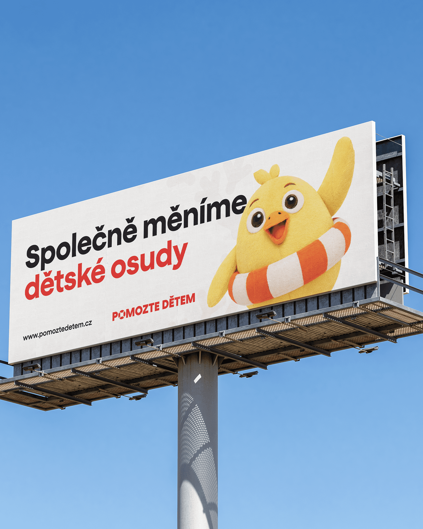
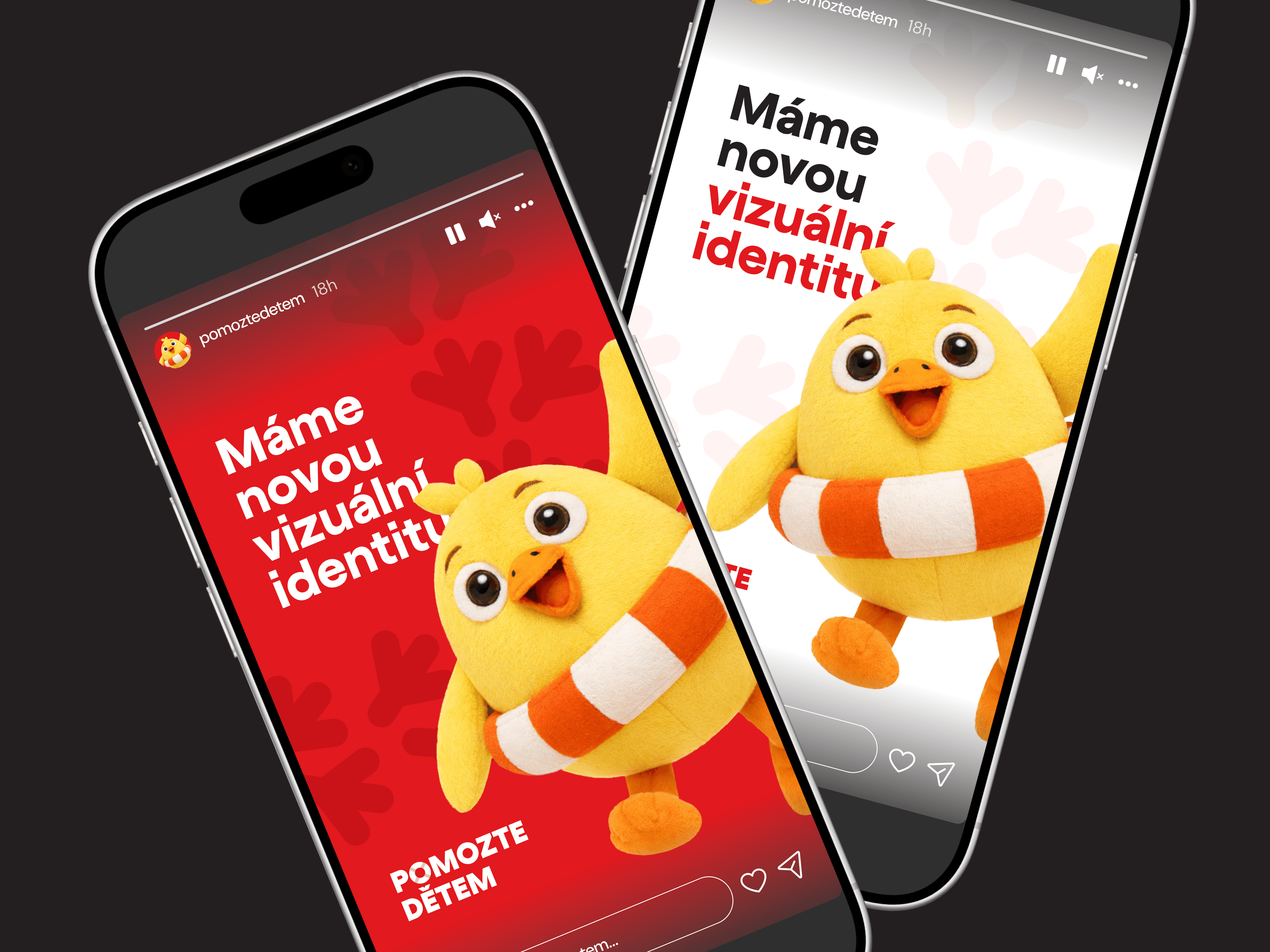
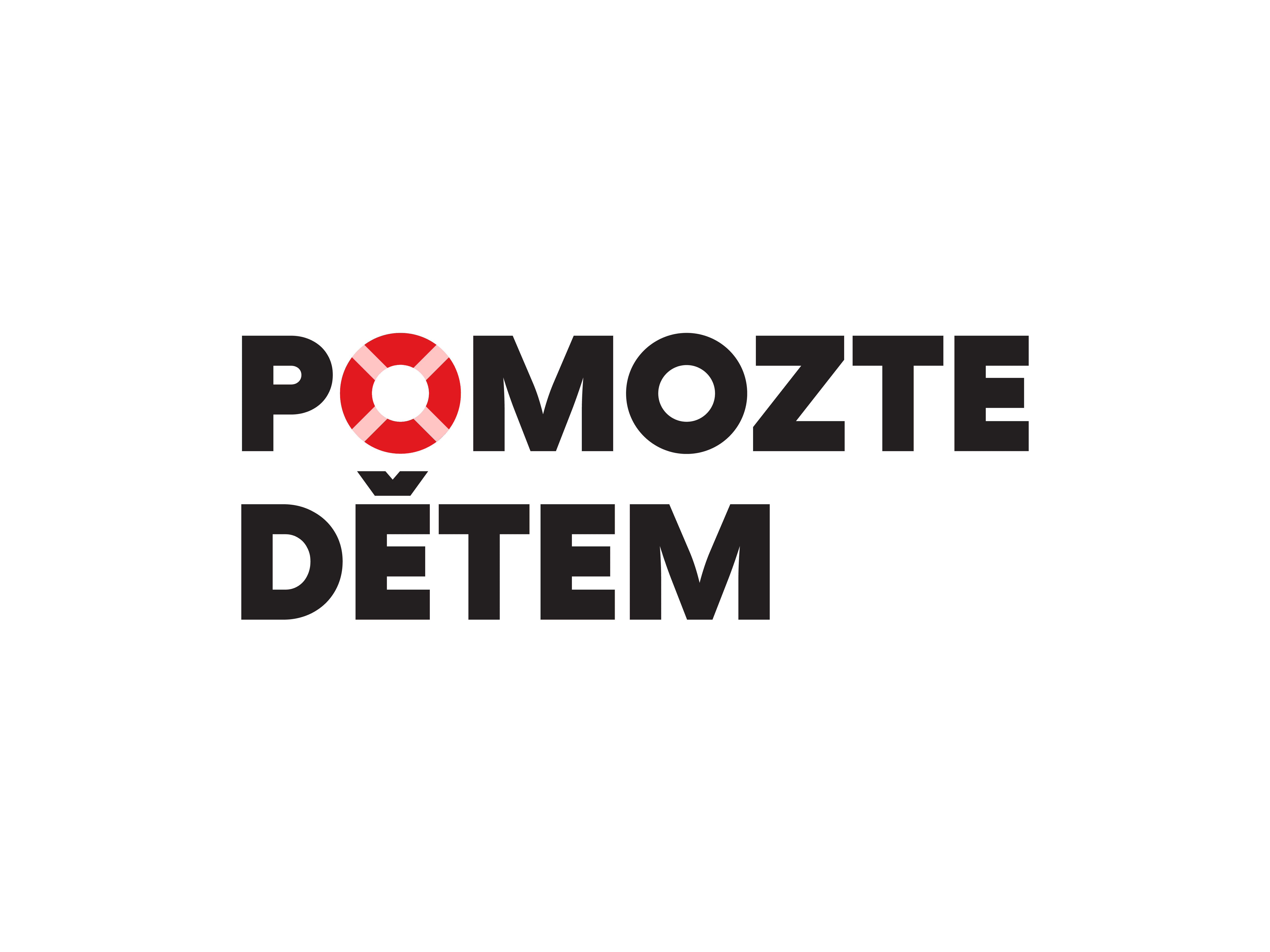
The redesign of the visual identity for the Pomozte dětem organization builds on the iconic symbol of a chick with a lifebuoy, which has long been associated with the emotion of help and solidarity. The goal was to modernize the brand, simplify it visually and bring it closer to today’s audience without losing its recognizability. The chick underwent a careful refinement of its shapes and expressive elements, resulting in a cleaner 2D illustrated version and a new 3D form with a subtle plush texture that feels warm and cute and supports an emotional connection with the public. We also expanded the logo system with minimalist variants that work only with the lifebuoy itself, which serves as a strong, universal symbol of help across all communication outputs. The result is a flexible visual identity that combines a love brand with a modern, innovative and emotive expression. This project was created together with Kreovize.