Simple Dumpl
About project
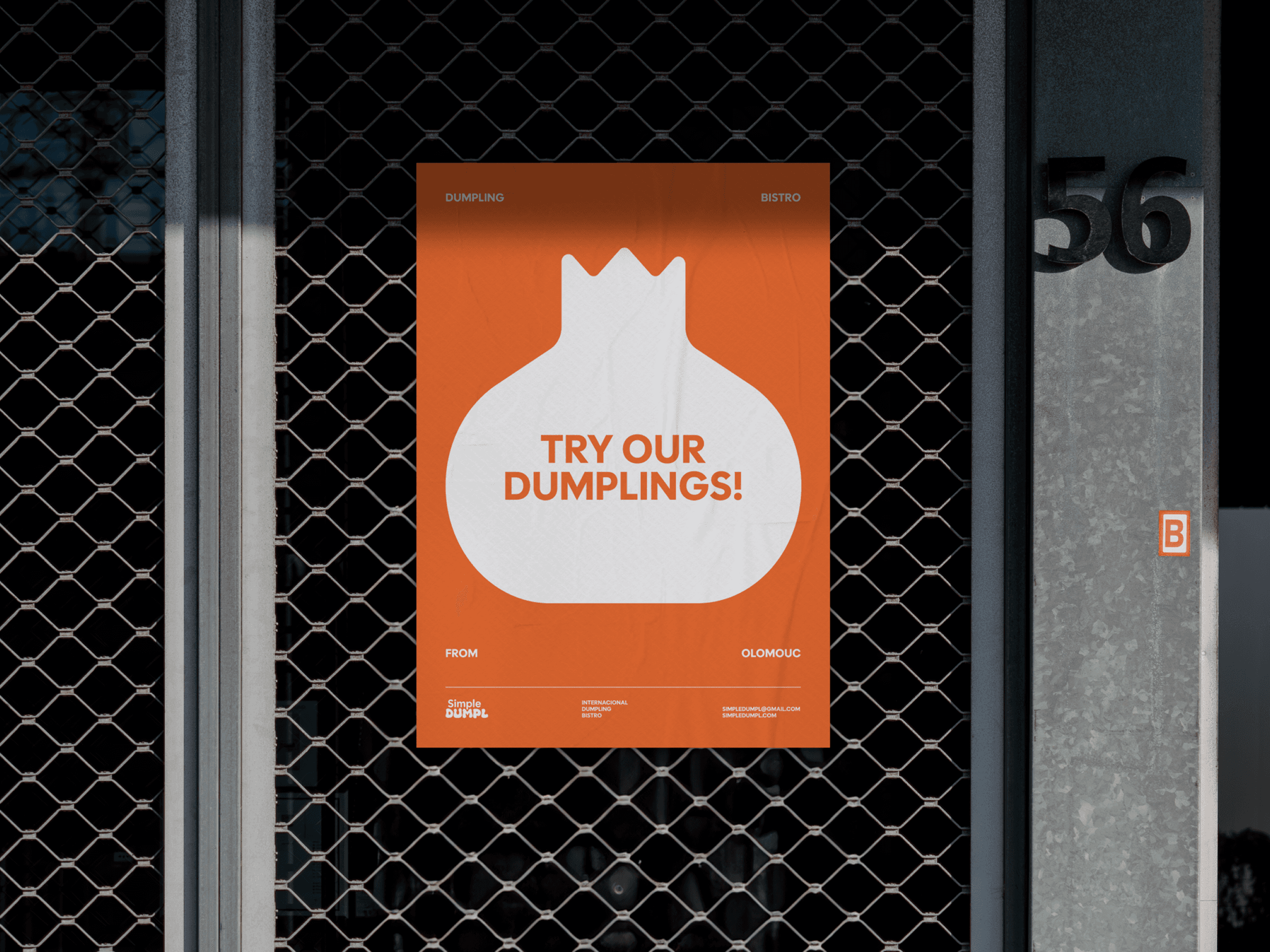
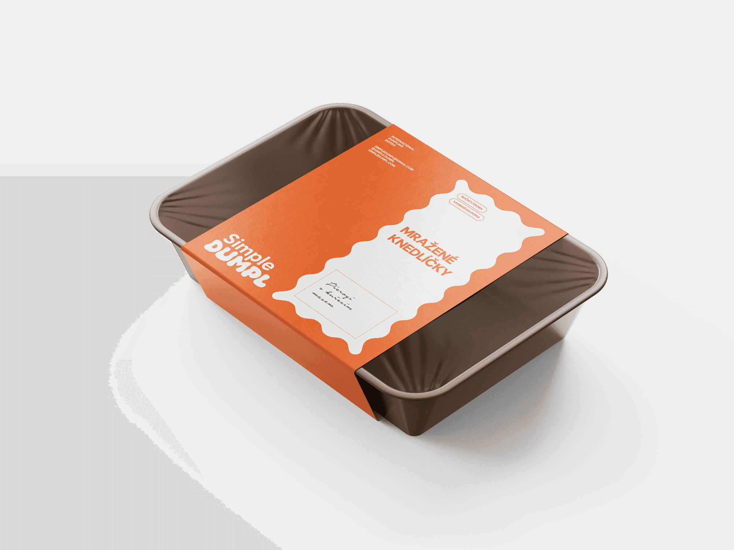
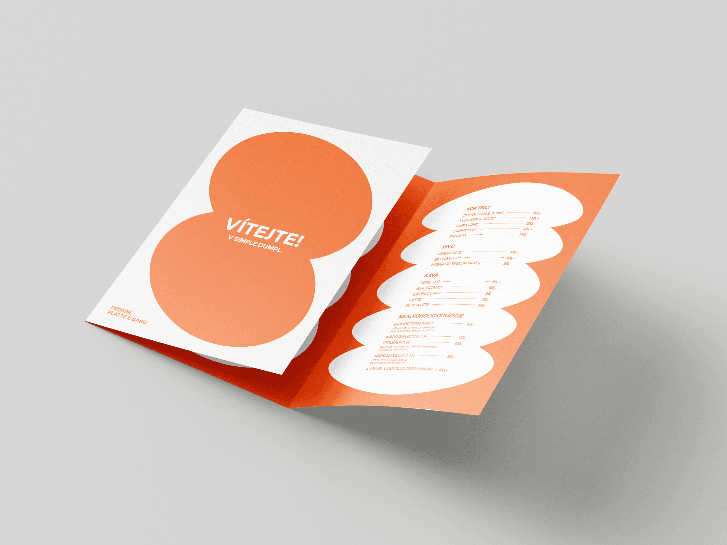
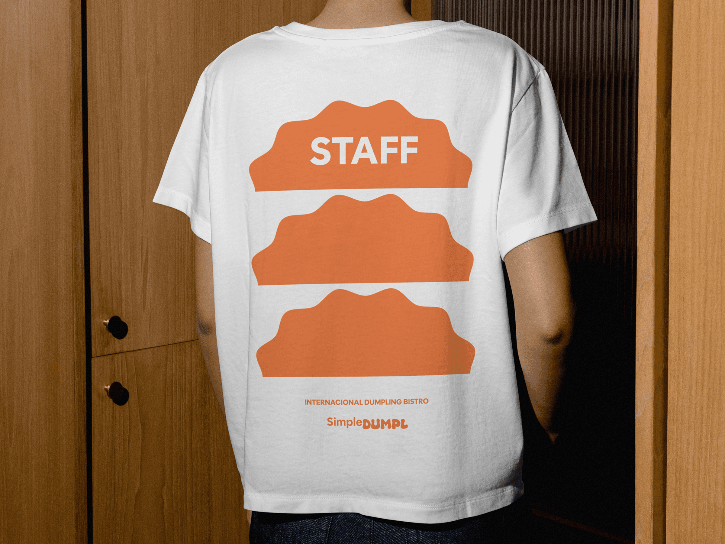
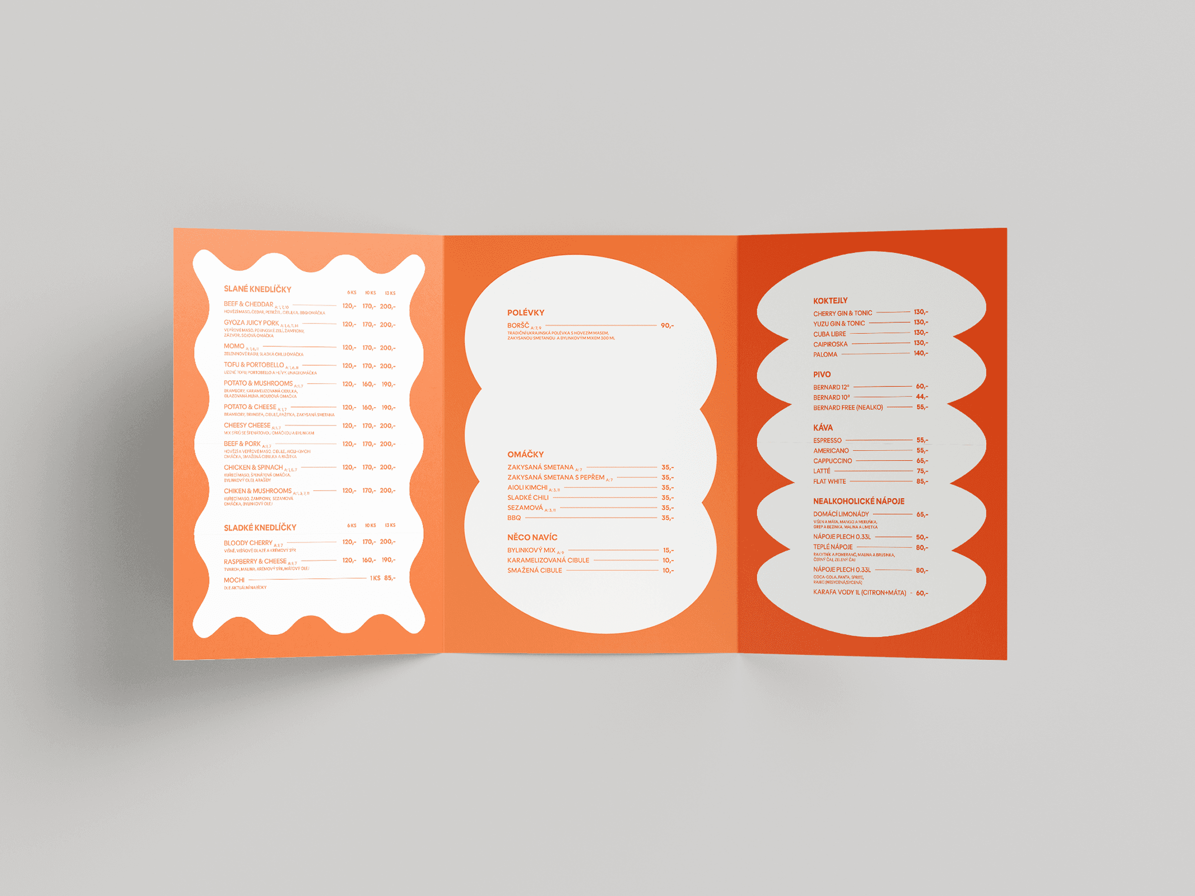
The visual identity of the Simple Dumpl brand is based on the concept of a bistro focused on dumplings from around the world, and it rests on combining diversity with simplicity. The core motif is a stylized pierogi shape, which works as a universal symbol of the product and gradually develops into a complete visual system. That system uses variable elements inspired by different types of dumplings, which serve both as dominant motifs and as elements that structure the layout.
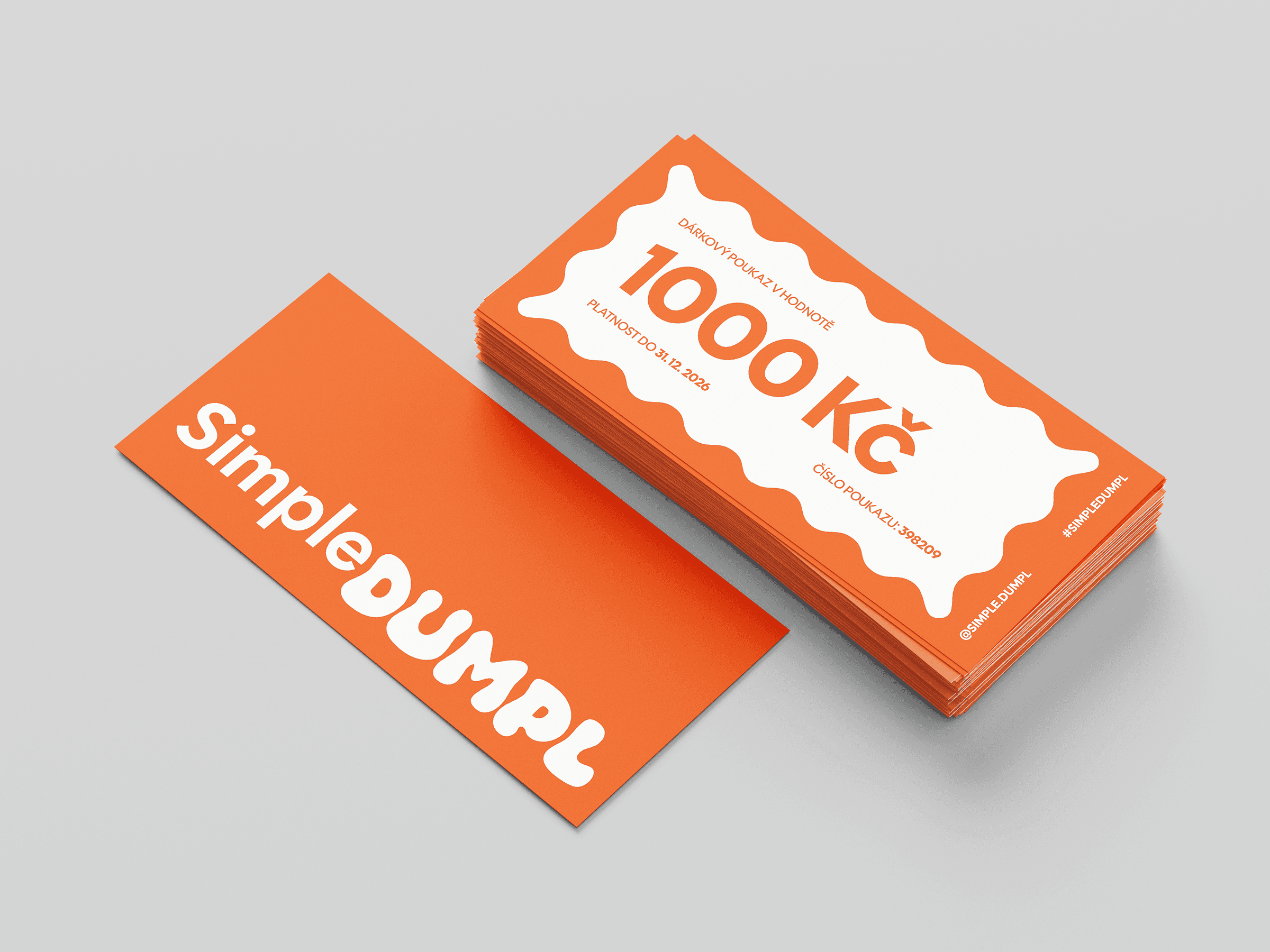
The typography builds on the contrast between the clean, modern look of the word “Simple” and the more shaped “Dumpl,” which evokes the softness and organic character of dumplings. As a result, the visual style is contemporary, clear and easy to apply across different formats. The identity thus forms a unified and distinctive whole that reflects both the global character of the brand and its accessibility.